
Making Charts and Graphs in Python

Master the art of visualizing financial data using Matplotlib for basic charts, Seaborn for statistical plots, and Plotly for interactive graphs.
In the realm of financial analysis, visual tools are invaluable for understanding market trends and making informed decisions. The Python code snippet provided is a compact yet powerful tool for visualizing stock price data, specifically for Apple Inc. (AAPL). Here's a simplified breakdown of how this code works and the insights it can offer:
Libraries and Data Retrieval
The script begins by importing essential libraries:
datetime: For handling dates, crucial for time-series analysis.
pandas: A staple for data manipulation in Python.
plotly: A versatile library for creating interactive plots.
yfinance: A convenient tool for fetching historical market data.
The code fetches AAPL's stock data from Yahoo Finance, using a timeframe starting from January 1, 2015, to the current date.
Data Processing
Next, it calculates two critical financial indicators:
MA50: The 50-day Moving Average, indicating short-term trends.
MA200: The 200-day Moving Average, reflecting longer-term market sentiment.
These indicators are often used by traders to understand market trends and predict potential reversals.
Visualization
The heart of this script lies in its visualization capabilities:
Candlestick Chart: The code generates an interactive candlestick chart for AAPL, offering a detailed view of daily price movements.
Moving Averages: It overlays the MA50 and MA200 on the chart, allowing users to see how the stock price interacts with these key indicators.
Volume Chart: Below the main chart, there's a bar chart for trading volume, providing insights into the market's activity and potential interest in the stock.
Customization and Presentation
The plot is finely tuned with titles, axis labels, and a color scheme that ensures clarity and visual appeal. The interactive nature of the chart, powered by Plotly, allows for a hands-on examination of the stock's performance over time.
In summary, this Python script is a potent tool for any financial analyst or enthusiast looking to dive into stock market trends. It leverages sophisticated libraries to fetch, process, and visualize market data in a way that's both informative and accessible.
import datetime as dt
import pandas as pd
import plotly.offline as pyo
import plotly.graph_objects as go
from plotly.subplots import make_subplots
import yfinance as yf

end = dt.datetime.now()
start = dt.datetime(2015,1,1)

df = yf.download('AAPL', start, end)
df.head()

df['MA50'] = df['Close'].rolling(window=50, min_periods=0).mean()
df['MA200'] = df['Close'].rolling(window=200, min_periods=0).mean()
df['MA200'].head(30)

fig = make_subplots(rows=2, cols=1, shared_xaxes=True,
               vertical_spacing=0.10, subplot_titles=('AAPL', 'Volume'),
               row_width=[0.2, 0.7])

fig.add_trace(go.Candlestick(x=df.index, open=df["Open"], high=df["High"],
                low=df["Low"], close=df["Close"], name="OHLC"),
                row=1, col=1)

fig.add_trace(go.Scatter(x=df.index, y=df["MA50"], marker_color='grey',name="MA50"), row=1, col=1)
fig.add_trace(go.Scatter(x=df.index, y=df["MA200"], marker_color='lightgrey',name="MA200"), row=1, col=1)

fig.add_trace(go.Bar(x=df.index, y=df['Volume'], marker_color='red', showlegend=False), row=2, col=1)

fig.update_layout(
    title='AAPL historical price chart',
    xaxis_tickfont_size=12,
    yaxis=dict(
        title='Price ($/share)',
        titlefont_size=14,
        tickfont_size=12,
    ),
    autosize=False,
    width=800,
    height=500,
    margin=dict(l=50, r=50, b=100, t=100, pad=4),
    paper_bgcolor='LightSteelBlue'
)

fig.update(layout_xaxis_rangeslider_visible=True)
fig.show()
And output should looks like this:
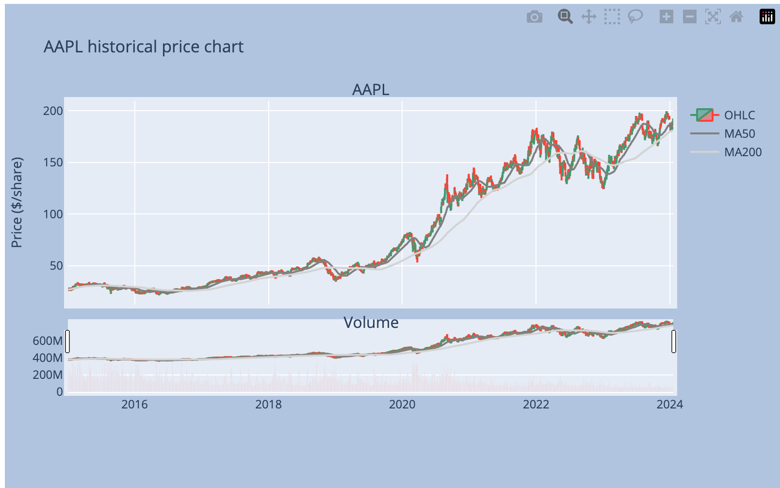
You may play with zoom-in or zoom-out and add some other tickers or signals.